It's (still) the economy, stupid
Overestimate the economy and gaslight consumers at your own political peril
“Why is Biden losing even though economic data are strong? Must be his age.”
No, listen. It’s the economy. It’s always the economy. This is all American voters care about. Sorry, I don’t make the rules.
There’s no question the headline numbers look good. GDP is rising. Unemployment is low. Real wages are reported to be rising for the working class.
Yet there’s a large divergence between these headline economic numbers and consumer sentiment, which throughout Joe Biden’s presidential term has been depressed.

Similarly, for a president apparently presiding over an economic boom, Biden’s approval ratings have been persistently poor.

Confronted with such “alternative” data, many Progressives insist that there is “no recession,” that consumers have it better than ever, and that the reasons for the divergence between headline measures and sentiment are purely behavioral.

There is some plausibility to this Progressive narrative blaming political messaging or cognitive bias for creating a misperception. Proponents cite surveys showing Americans are more upbeat about their personal finances than the national economy, with 60% saying their finances are good, but 71% saying the economy is poor.
One could even argue that this is rational. Consumers prefer price stability, even when wages grow faster than prices, because price instability creates uncertainty about the future. Consumers lack confidence that, if inflation continues, their wages will continue to keep up.
But this is not the whole story. When headline numbers diverge this much from the wisdom of crowds, you can either shout down the crowd, or you can take a hard look at your headline measures. When we take the latter approach, we find that the headline data misses some important nuances about the current economy.
Limitations of the headline metrics
There are three important ways in which the headline GDP and unemployment numbers misrepresent the current economic reality:
-
Headline metrics exclude borrowing costs.
-
Headline metrics flatten differential inflation rates.
-
Headline metrics mask underlying labor market weakness.
Let’s take these one at a time, in roughly order of importance.
1. Headline metrics exclude borrowing costs
As economist Lawrence Summers and his coauthors argue in a new NBER paper, “the cost of money is part of the cost of living,” so it’s problematic that the Consumer Price Index (CPI) we use for measuring cost-of-living inflation doesn’t include borrowing costs. And since interest rates increased over the past year along with prices, borrowing costs are definitely up.
In fact, if we construct an alternative measure of inflation that includes borrowing costs, inflation last year looks catastrophically worse. Summers and his coauthors estimate that inflation peaked at over 18%, and that year-over-year growth of personal interest payments exceeded 60%.


They argue that this alternative inflation measure explains over 75% of the recent divergence between consumer sentiment and headline economic measures.
2. Headline metrics flatten differential inflation rates
About 2/3 of Americans own the house they live in, and homeowners are less affected by changes in housing prices than the 1/3 of Americans who rent the place they live. Unless a homeowner decides to move, housing fluctuations may affect their cost of living not at all.
Yet when we “adjust” wages for inflation to measure “real wage growth” for different segments of the population, we always use a single inflation number, as if rich and poor have experienced the same inflation rate. The reality is that cost of living inflation is disproportionately borne by the bottom tercile of earners, the lion’s share of whom are renters. That makes charts like this one, that show “real hourly wages” increasing for the bottom decile, extremely misleading.

The story this chart tells about “real wage growth” for the bottom decile is tough to square with other data, such as credit card delinquencies, that show consumers under more financial stress than at any time in the last decade:

In fact, a recent Gallup poll found that over half of Americans say they are worse off financially than they were a year ago, which is the highest number since the depths of the Great Financial Crisis in 2009. The reality is that in this era of high inflation, as in most economic crises throughout history, the poor have borne the brunt.
3. Headline metrics mask underlying labor market weakness
Although the headline unemployment rate is low, alternative data hint at underlying weakness. For instance, economists note that the economy has added 1.6 million jobs since March 2023, but full-time employment is down by 1.1 million over the same period. That’s because more workers are working part-time, often involuntarily.

We are also recently seeing a gap open up between “initial claims for unemployment insurance” (a measure of how many people were laid off last week) and “continuing claims for unemployment insurance” (a measure of how many people received unemployment insurance last week because they haven’t yet found a job).
Initial claims are flat, which means there aren’t too many layoffs happening, but continuing claims are rising, which means the people who have been laid off are having a hard time getting rehired. In fact, it’s rare outside of a recession to see continuing claims rise this much.

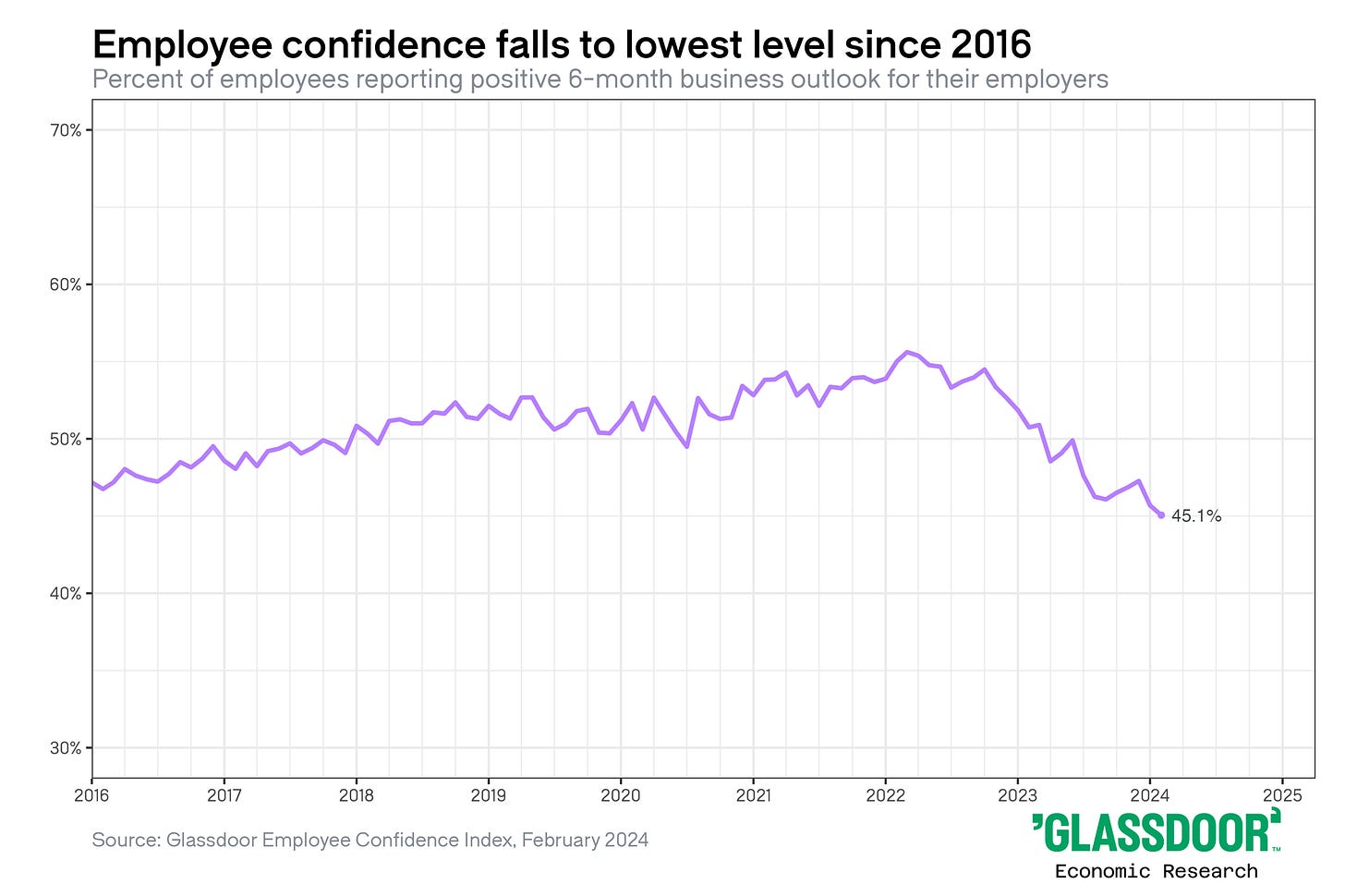
Likewise, data published by Glassboro show layoff anxieties high and employee confidence plummeting.
And then there are the people who don’t show up in this data at all. If you’re a freelancer or contractor or recently moved across state lines, you may not be eligible for unemployment insurance when you get laid off. In our increasingly mobile gig economy, more and more people are falling through these cracks.
And it’s these workers, unfortunately, who have been most affected by the rise of generative AI. According to the Financial Times, freelance income fell by nearly 10% within five months of the rollout of ChatGPT.

Don’t let headline metrics become a target
Goodhart’s Law says that “when a measure becomes a target, it ceases to be a good measure.” And that’s part of what’s happening here.
Headline economic metrics are usually a good proxy for how Americans are doing, but “gaming” the metrics won’t get policymakers reelected if voters feel bad, and no amount of pounding the GDP chart will make them feel good.
When consumers tell us they’re in trouble, we need to believe them. And if our measures missed it, we need to have the humility to reassess the measures. Remember, it’s only a “silent recession” to elites who aren’t struggling to buy groceries or pay the bills.


